Back to Resources
Communicating Insights: The Art of Visualization
Data is only as powerful as your ability to communicate it. Learn the core principles of effective storytelling with data.
"The goal is to turn data into information, and information into insight."
Don't Just Show Data—Tell a Story
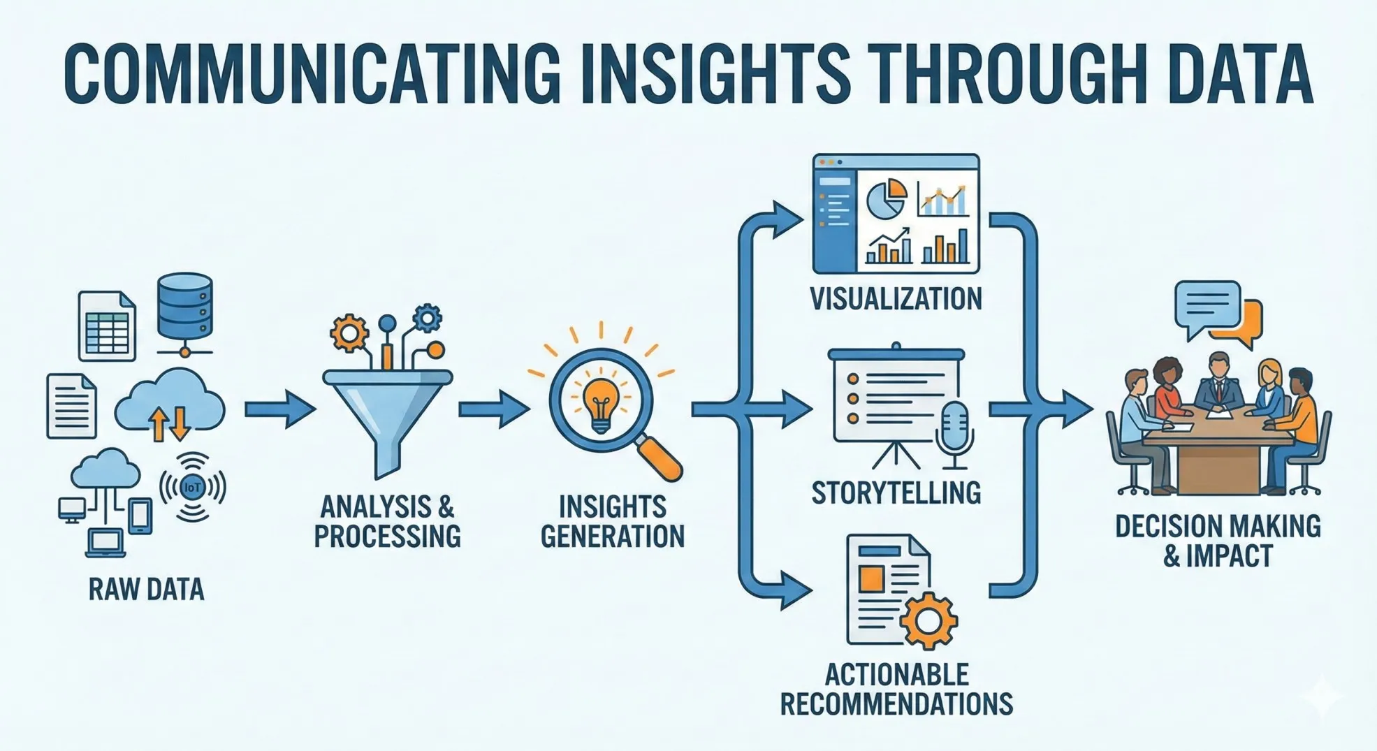
One of the core modules in Week 3 of our program focuses on Data Visualization. A common mistake junior analysts make is over-complicating their charts, assuming that complexity equals competence. In reality, the most skilled analysts are those who can distill massive datasets into clear, actionable visuals.
3 Principles We Teach at Ngao Labs
We train our learners to follow a "Communication First" approach using industry-standard libraries like Matplotlib and Seaborn:
- Know Your Audience: A technical stakeholder needs to see the distribution and variance (technical charts), while a business executive needs to see the trend and the "so what" (impact charts).
- Less is More: We teach the concept of "Data-Ink Ratio." Remove every element that doesn't add new information. If a gridline, background color, or 3D effect doesn't help the user understand the data faster, delete it.
- Color with Purpose: Color shouldn't be used to make a chart "pretty." It should be used to draw the eye to the most important insight or to categorize data points meaningfully.
By mastering these principles, our graduates don't just produce reports—they drive the decision-making processes of the organizations they join.